Most investors spend their time watching earnings, price-to-earnings ratios, and central bank press conferences. But the data point that sits quietly behind all of those - the one that tells you whether liquidity is being injected into the financial system or drained from it - is M2 money supply. And most people have never looked at it seriously.
I started paying close attention to M2 after the 2020-2021 period, when the United States added roughly $6 trillion to its money supply in less than two years. At the time, that number felt abstract - a statistic from a Federal Reserve data release. Then inflation hit 9.1%, asset prices surged to levels that defied traditional valuation frameworks, and everything from housing to used cars to technology stocks repriced simultaneously. The M2 chart, in retrospect, had explained all of it before it happened.
This course is my attempt to make M2 genuinely useful to you as an investor and market analyst - not as a textbook definition, but as a live instrument for reading the economy's liquidity environment. Once you understand how M2 is constructed, how it has behaved across different monetary regimes, and how it interacts with inflation and asset prices, you will see the financial world differently.
What Is M2 Money Supply?
M2 is the Fed's broadest regularly-reported measure of the US money supply. Not just the cash in your wallet and your checking account - also the money parked in savings accounts, money market funds, and small CDs. Basically: how much spending capacity exists in the economy right now?
Why do we need a "money supply" measurement at all? Because economists and central bankers need to know whether the financial system is expanding or contracting. And "money" is not as simple as it sounds. The $20 bill in your pocket is money. So is the $10,000 sitting in your money market fund, even though you can't spend it at the grocery store. M2 draws the line at a reasonable place - capturing most forms of highly liquid wealth without going so far as to include everything that could theoretically be converted to cash. It's imperfect. But it's the best single number we have.
The Fed reports it monthly. The St. Louis Fed's FRED database is the canonical public source. As of July 2025, US M2 stands at approximately $22.2 trillion. That number has more than doubled since 2010. Grown 84% since 2015 alone. And the shape of how that growth happened - the steady climb, the COVID explosion, the unprecedented contraction, the recovery - is arguably the most important story in US macroeconomics over the past decade.
The Building Blocks: What Goes Into M2?
M2 is built in layers, each one adding a broader category of near-money. The composition matters because different components respond differently to monetary policy. When the Fed hikes rates, the savings component behaves completely differently from currency in circulation.
Simplest way to think about it: M2 = M1 + savings deposits + small time deposits + retail money market fund shares. M1 is the narrow stuff - physical currency plus checking accounts. M2 adds the instruments that aren't quite cash but are close enough that economists count them as part of the economy's usable money pool. Your savings account isn't technically "money" in the strictest sense, but try telling someone with $50,000 in a savings account that they don't have money.
M2 Component Breakdown (approximate US shares)
The dominant component - savings and money market accounts at roughly 52% - is the piece that moves most dramatically. When the Fed cuts rates and banks flood the system with liquidity, these balances swell. When rates rise and investors shift money into higher-yielding alternatives like T-bills or large CDs above $100,000 (which fall outside M2), the composition changes noticeably. This is what makes M2 a living instrument, not a static measure. It reflects where the economy's liquid wealth is actually sitting - and that distribution tells you something important about investor behaviour, risk appetite, and the effectiveness of monetary policy in real time.
Reading the Chart: Ten Years of Liquidity History
One chart. Ten years. The entire story of modern monetary policy compressed into a single line - the long steady climb of the 2010s, the COVID explosion, the unprecedented contraction, and the cautious recovery. If you learn to read this chart properly, you'll never look at asset prices the same way again.
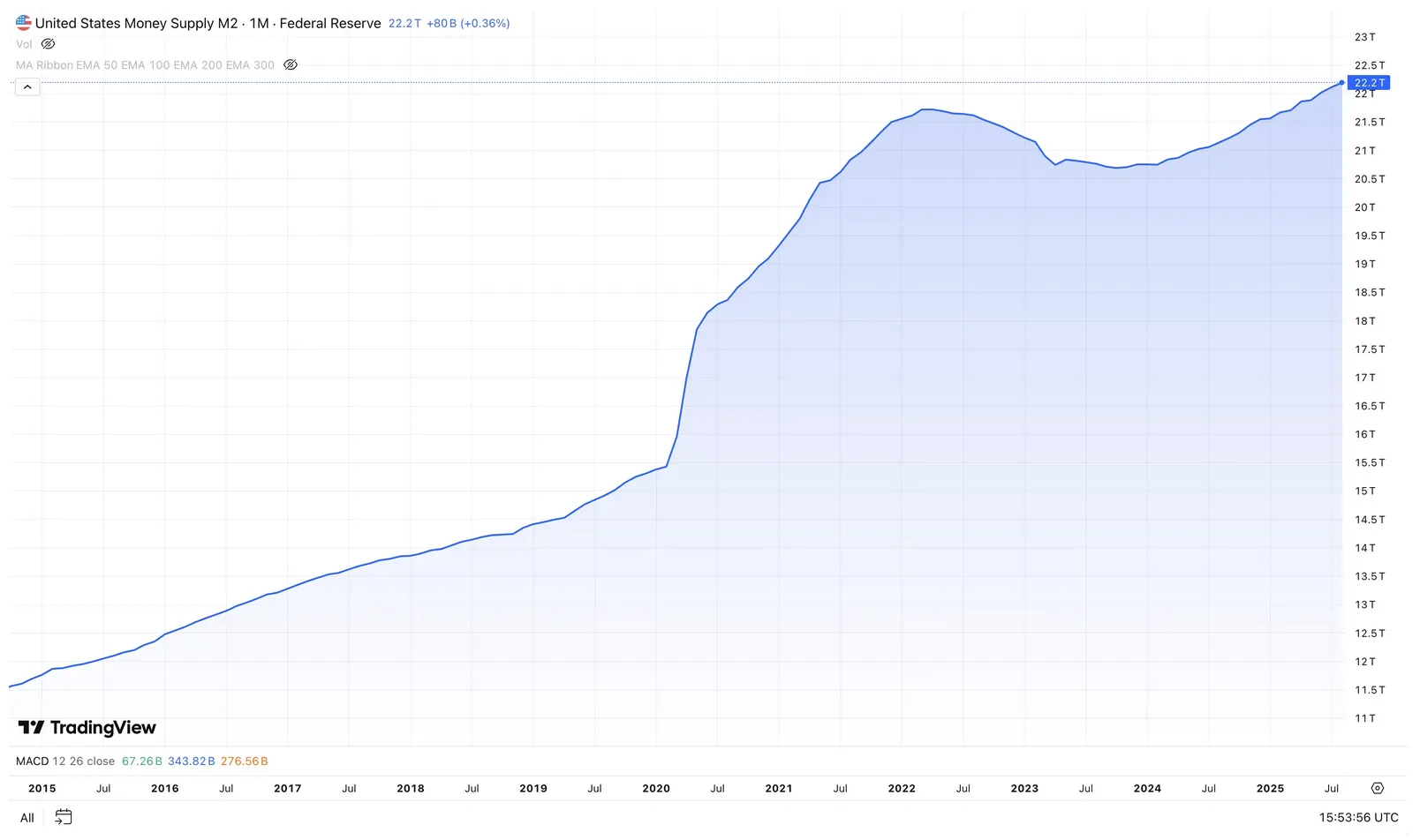
Look at that chart carefully. From 2015 to early 2020 - five years - M2 grew from about $12 trillion to $15.5 trillion. Steady, unspectacular, roughly 4-5% per year. Then, between March 2020 and April 2022, it exploded from $15.5 trillion to $21.7 trillion. That is a $6.2 trillion increase in 25 months - a 40% expansion in just over two years. To put that in perspective, the previous 40% expansion had taken nearly 15 years.
- Apr 2022
- Oct 2023
- Jul 2025
That $6.2T wasn't evenly distributed. The bulk landed in savings and demand deposits - people got stimulus cheques and either couldn't spend them (lockdowns) or didn't want to (uncertainty). This created what economists call a "monetary overhang" - an enormous pool of purchasing power sitting there, waiting. When it was finally released into spending in 2021 and 2022, it slammed into supply chains that were already broken. The result: 9.1% CPI. The highest inflation in 40 years. And the M2 chart had been screaming about it for over a year before the CPI numbers confirmed it.
M1, M2, M3 - Where Do You Draw the Line?
The money supply isn't one number - it's a family of measurements, each drawing the boundary at a different degree of liquidity. Knowing where M2 sits in that family clarifies what it captures and, just as importantly, what it misses.
- Physical currency and coins
- Checking / demand deposits
- Traveler's checks
- Other liquid deposits
- Everything in M1
- Savings deposits & MMAs
- Small time deposits (<$100k)
- Retail money market funds
- Everything in M2
- Large time deposits (>$100k)
- Institutional money market funds
- Repurchase agreements (repo)
- Eurodollar deposits
This isn't just an academic distinction. M1, as currently defined, has effectively converged with M2 since the Fed's 2020 reclassification - making it less useful as a separate signal. M3 captured institutional repo markets and large time deposits, components that are extremely sensitive to wholesale liquidity stress. When the Fed stopped publishing M3 in 2006, analysts lost a leading indicator. And then 2008 happened. The shadow banking system - which M3 partially captured - was the epicentre of the financial crisis. Some economists still argue that discontinuing M3 was one of the worst data decisions the Fed ever made. Whether that's right or not, it's a reminder that what you can't see can hurt you.
M2 and Inflation: A Mechanism Debate
Does printing money cause inflation? This has been the most contested question in monetary economics for the past decade. The 2021-2022 episode reignited a debate that many thought was settled. The answer turns out to be: it depends. But the "depends on what" part is where the real insight lives.
Milton Friedman's famous line: "Inflation is always and everywhere a monetary phenomenon." The Quantity Theory of Money says MV = PQ - money supply times velocity equals price level times real output. Double the money supply, hold velocity constant, and prices eventually double. More money chasing the same goods. Simple and elegant.
Except velocity isn't constant. Not even close. It varies with confidence, interest rates, technology, and the structure of the banking system. Between 2010 and 2020, M2 grew steadily but velocity fell sharply. Banks accumulated reserves. Households rebuilt savings after the GFC. The money was created but it sat still - pooled behind a dam, going nowhere. And inflation stayed subdued. For a full decade. The monetarists looked wrong. The Keynesians took a victory lap.
- Quantity Theory: MV = PQ holds over the long run
- 2021–22 vindicated Friedman after decades of dormancy
- M2 growth of 25% YoY preceded CPI of 9.1% by ~12–18 months
- Historical: every hyperinflation has been preceded by massive M2 expansion
- The mechanism is delayed, not absent
- Banks create money in response to credit demand (endogenous money)
- 2010–2020: M2 grew strongly without producing inflation
- Velocity matters enormously - pooled liquidity doesn't inflate
- 2021–22 inflation driven by supply shocks (COVID, Ukraine) as much as money
- QE expanded bank reserves, not M2 broadly - much stayed locked in the system
My own reading? Neither camp is fully right, and 2020-2022 proved it. The episode showed that massive M2 expansion combined with direct fiscal transfers - money going straight into people's bank accounts, bypassing the normal banking friction - absolutely produces inflation when supply constraints exist. But 2010-2020 showed just as clearly that QE-driven M2 growth, where the liquidity sits in bank reserves and institutional accounts rather than flowing to consumption, can persist for a decade without consumer price inflation. (It does produce asset price inflation, though. Just ask anyone who tried to buy a house in 2019 San Francisco.)
The practical takeaway: watch both the level and the composition of M2 growth. Money flowing into savings deposits and money market funds is fundamentally different from money flowing directly to households through fiscal policy. The transmission mechanism matters as much as the number itself. $6 trillion in QE sitting in bank reserves behaves nothing like $6 trillion in stimulus cheques sitting in checking accounts. Same M2 growth, completely different economic consequences.
The Fed's Playbook: How Monetary Policy Moves M2
Here's an important nuance: the Fed doesn't directly control M2. It controls the fed funds rate and its own balance sheet. But those tools work through the banking system to influence M2 in ways that are powerful, imprecise, and lagged. The "lagged" part is what catches most investors off guard.
The primary mechanism is straightforward. When the Fed raises the fed funds rate, borrowing gets more expensive everywhere. Banks pay more to fund themselves. Consumers face higher mortgage and credit card rates. Businesses cut back on investment. Credit growth slows. And since bank lending is one of the primary engines of M2 expansion (when a bank makes a loan, it simultaneously creates a deposit - that's the core insight of modern monetary mechanics), the pace of M2 growth decelerates. Money creation slows down.
Reverse it and you get the opposite. Fed cuts rates, borrowing gets cheaper, credit flows more freely, M2 accelerates. The 2020-2022 period was the extreme version: rates at zero plus $120 billion per month in QE produced the fastest M2 expansion in post-war history. The Fed was essentially pressing the accelerator with both feet while Congress threw stimulus cheques out the window. The result was predictable. Or should have been.
The 2022-2023 tightening cycle was a rare natural experiment. The Fed hiked from 0.25% to 5.5% in 16 months while running QT at up to $95 billion per month. M2 fell year-over-year for the first time since the 1930s. Not a coincidence - the intended effect. And the market's reaction was instructive: growth assets that had been priced on the assumption of perpetual cheap liquidity got repriced. Hard. Cathie Wood's ARK fund fell 75% from peak. Crypto crashed. SPACs evaporated. Liquidity withdrawal, made visible in the stock market.
So for a market researcher, the Fed's policy trajectory is the single most important forward-looking input for M2 analysis. Easing (rate cuts, QE) = supportive of liquidity-sensitive assets. Tightening (rate hikes, QT) = the tailwind reverses. The catch: there's a 6-18 month lag. By the time the M2 print confirms the shift, markets have often already moved. You need to look at where the Fed is going, not where it's been.
Interest Rates and M2: The Two-Way Street
Rates affect M2 growth. But M2 growth also contains information about the future path of rates. The relationship runs both ways, and understanding that two-way street is essential for reading the monetary cycle correctly.
When rates rise sharply, something interesting happens inside M2. Money migrates from savings deposits and money market funds toward instruments that fall just outside the M2 boundary - large CDs, Treasury bills, and institutional money market funds. That's exactly what happened in 2022-2023. When you can earn 5%+ on a T-bill but your savings account pays 0.5%, it's obvious where the money goes. And here's the kicker: that flow actually reduced M2 directly. Not because the money was destroyed, but because it moved into a category that sits outside the M2 definition. Same dollars, different bucket. M2 drops, but actual liquidity hasn't changed.
This has an important implication that many analysts miss: M2 contraction doesn't always mean liquidity is as tight as the headline suggests. A meaningful portion of the 2022-2023 decline reflected portfolio reallocation, not genuine purchasing power destruction. Households still had the money. It was just in T-bills instead of savings accounts. When rates eventually came down, that money flowed back into M2-counted instruments, and the aggregate recovered. If you'd been watching only M2, you would have overestimated how tight conditions really were.
A Global Perspective: M2 Beyond US Borders
The US doesn't have a monopoly on the money supply question. Every major economy has its own version of broad money, and the global picture - particularly China - often tells a completely different story from what you'd see looking at US M2 alone.
China's M2 is the largest in the world. Over 300 trillion yuan - roughly $41 trillion at current exchange rates. Nearly double the US figure. That number reflects China's different financial architecture: high savings rate, heavy reliance on bank intermediation, and state-directed credit expansion. But it also reflects decades of rapid credit growth funding urbanisation, infrastructure, and industrial expansion. China's M2 was growing at 7-12% annually throughout the 2010s, consistently above GDP growth. Is that a support for growth or a ticking time bomb of financial risk? Economists genuinely disagree. But either way, it's a number that affects global asset prices in ways that most US-centric analysts underappreciate.
The divergence between US and global M2 cycles creates genuine cross-asset opportunities. In 2022-2023, the US ran aggressive tightening while China was simultaneously easing to prop up its post-COVID reopening and its collapsing property sector. That divergence drove dollar strength (US rates rising relative to peers), suppressed commodity prices (Chinese demand disappointing), and created a bifurcated global asset market. If you were only watching US M2, you missed half the picture.
Japan is the most instructive contrast. The Bank of Japan maintained ultra-loose policy - yield curve control, near-zero rates - long after everyone else started tightening. Japanese M2 grew modestly but consistently. The result? A massive carry trade. Investors borrowed yen cheaply, converted to dollars, and invested in higher-yielding assets globally. Free money, essentially. Until the BoJ finally started raising rates in 2024, and the carry trade unwound in what felt like about 48 hours. One of the fastest volatility spikes in global equity markets in recent memory. A visceral reminder that liquidity cycles are globally interconnected, and when one of them snaps, the whole web shakes.
What M2 Tells a Market Researcher
After all the theory, the practical question is: how does a serious investor or market researcher use M2 as a tool? I'll give you my own framework - not the textbook answer, but the one I actually apply.
The first thing I look at is the year-over-year rate of change in M2, not the absolute level. Whether M2 is $15T or $22T is less important than whether it is expanding or contracting, and at what pace. A rising M2 growth rate - particularly one accelerating above nominal GDP growth - signals that liquidity is building in the system. A falling M2 growth rate, especially one turning negative, signals the opposite. Asset markets tend to follow liquidity with a 6–18 month lag.
Second dimension: real interest rates. When real rates are deeply negative (as they were in 2021, with inflation running 7%+ and fed funds near zero), holding cash in M2 instruments is genuinely destructive of purchasing power. Your savings account is losing 6% in real terms annually. So money gets pushed out of M2 accounts and into real assets - equities, property, commodities. This drives asset price inflation even as consumer prices are climbing. The reversal signal? When real rates turn positive. Which they did, aggressively, in 2022-2023. And peak valuations in rate-sensitive assets coincided almost exactly with that crossover.
Third dimension, and most people miss this one entirely: global M2. Capital flows freely between major markets. A contraction in US M2 while China is expanding can be partially offset by Chinese capital flowing into US assets. The DXY dollar index is a useful proxy here - a rising dollar typically means global liquidity is contracting; a falling dollar suggests it's expanding. If you're only watching the US M2 print, you're looking at one room of a very large house.
Key Takeaways
- M2 is the Federal Reserve's primary broad money measure, combining cash, checking accounts, savings deposits, and retail money market funds - totalling approximately $22.2 trillion as of July 2025.
- The 2020–2022 pandemic episode produced the largest peacetime M2 expansion in US history (+40% in 25 months), driven by a combination of Fed QE, zero interest rates, and direct fiscal transfers to households.
- The subsequent M2 contraction of 2022–2023 - the first since the Great Depression - coincided precisely with the sharpest equity market sell-off since 2008, particularly in liquidity-sensitive growth assets.
- M2's relationship with inflation is real but lagged and conditional. The transmission mechanism depends on velocity and how the new money enters the economy - direct fiscal transfers are more inflationary than QE sitting in bank reserves.
- The Fed controls M2 indirectly - through interest rate policy (which affects credit demand) and QE/QT (which affects the level of bank reserves and long-term yields). There is a 6–18 month lag in the transmission.
- M2 contraction during rate hike cycles is partly an accounting artefact: money migrates from M2-counted savings accounts into T-bills (excluded from M2), understating available liquidity. A complete picture requires looking at M2 plus near-M2 instruments.
- Globally, China holds the world's largest M2 aggregate (~$41T equivalent), growing at 7%+ annually. Cross-country M2 divergences drive currency trends, carry trades, and capital flows that affect all asset classes.
- Practical framework: track M2 YoY change, real interest rates, and global M2 divergence as a three-variable liquidity barometer. Positive M2 growth + negative real rates = the most favourable environment for risk assets.
Research, PolyMarket Investment Strategies, July 2025